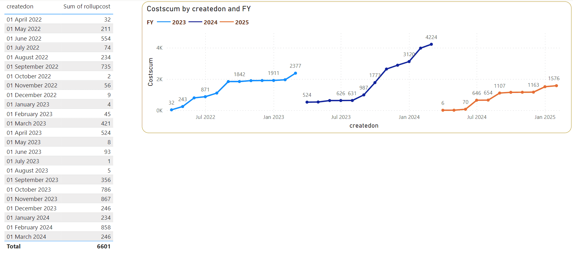
I was asked by a client to make their “cost” amount for each fiscal year appear on the same line chart. You can do this by having separate formulas or you can have one formula and separate the lines by legend.
I used the function called DatesYTD. Which you can set your last day of your Fiscal Year, its really handy.
I have a Power BI pbix file for your reference so that you can see the formulas. Download it here
The dataset
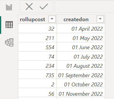
Lets say you have a dataset that looks like this
| createdOn | rollupCost |
|---|---|
| 2022-01-10 | 32 |
| 2023-04-05 | 211 |
| 2022-11-09 | 74 |
In Power BI it might look this image below
Make a date table
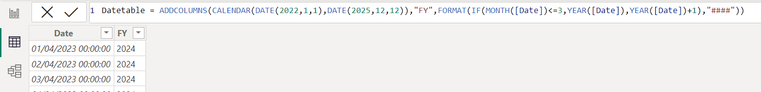
I like making a date table so that its centralised and useable by other tables too. Make a dax table like this
Datetable = ADDCOLUMNS(CALENDAR(DATE(2022,1,1),DATE(2025,12,12)),"FY",FORMAT(IF(MONTH([Date])<=3,YEAR([Date]),YEAR([Date])+1),"####"))
It will look like this when you are done
The FY is important as you will use this as your legend.
You will make a relationship between your date column in this table and your “createdOn” date column in the data table created in the previous step.
Now for the magic DatesYTD trick
Here is the DAX forumla you need. Notice the “03-31”, that means March the 31st as the last day of your Fiscal Year.
Costscum = CALCULATE(SUM(requirements[rollupcost]),DATESYTD(requirements[createdon],"03-31"))
Use a normal “line chart” and add your createdOn date column in the X-axis and in the Y-axis you put the Costcum formula from above. Put your FY column from the DateTalbe in as your legend.
P.S you can usee the date column from DateTable (but it won’t do a running total if you do, as the formula above uses the “createdon” column in the DatesYTD)
And this is the result!